Photo Friday: Overcast
After the break: Tracking rogue signals, AI can't copy my handwriting, and a sick Sopranos meme
We got rain this week! The temperatures tumbled and the clouds rolled in and I haven’t been this happy in months. I wore corduroy and wool and nothing but fall colors. I’m in heaven.
Everything about this cloudy existence this week has been wonderful, but I did notice that I don’t tend to think to take my camera out with me as often when it’s overcast. The forecast pretty much assigned this week’s topic to me. Overcast!
I took my camera out and got a couple of compositions, but honestly they weren’t great. I’ve been working a lot this week and didn’t really get out of the house except to get coffee around the corner, and the shots I got felt forced and boring. So this is an archive dive week!
Photos
1.
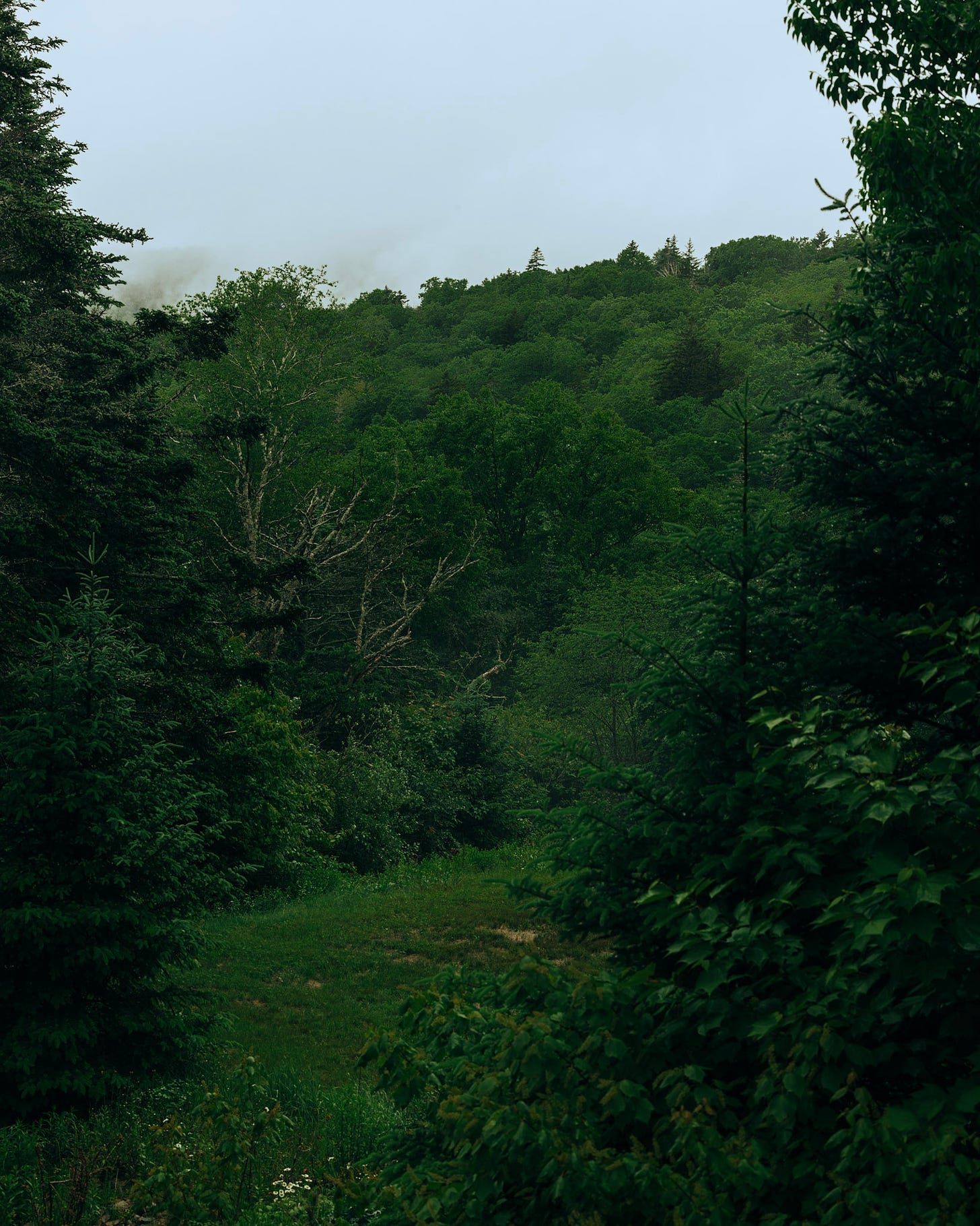
I went to New Hampshire for the first time last summer. I was there for a funeral, unfortunately, but I was there with friends I don’t get to see often. The service was in the White Mountains and when I needed a bit of a break, I would step outside and just look at the scenery and take some photos if I saw something worth shooting.
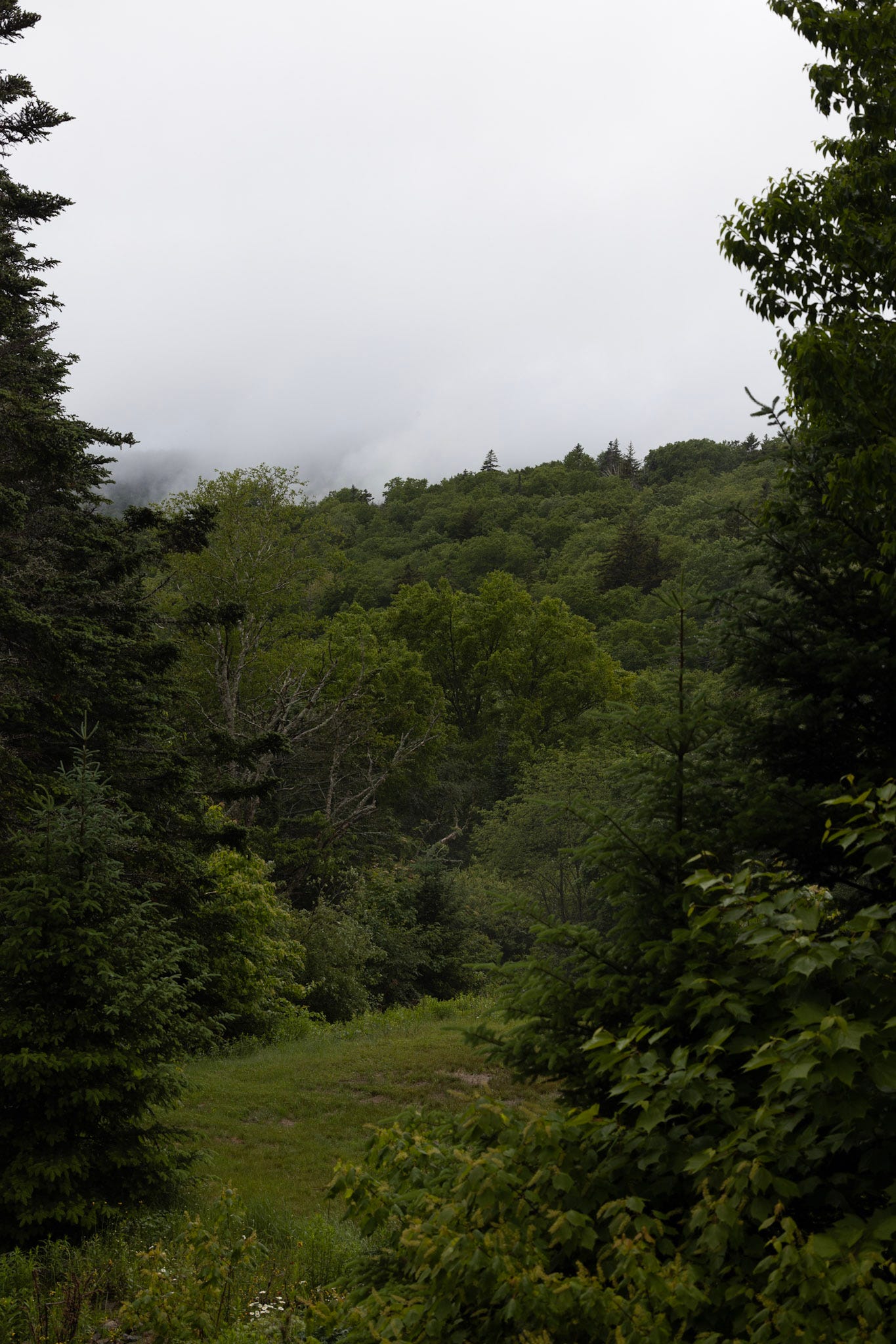
The clouds and the overwhelming greenery made the scenery that was beautiful to behold didn’t end up making for great photos. I never ended up publishing any of the photos after taking them originally, but I decided to go back to them this week. This composition was the most interesting one, and I managed to nail the green tone in a way I couldn’t in some of the others.
I don’t think the composition on this one is anything to write home about. The greenery in the upper right hand corner throws things off balance, and I wish it weren’t there. But I like that it feels like I’m exploring a hidden clearing or peeking in on something I wasn’t supposed to see when I look at the image. I also like the little flowers at the bottom of the frame.
Original:
2.
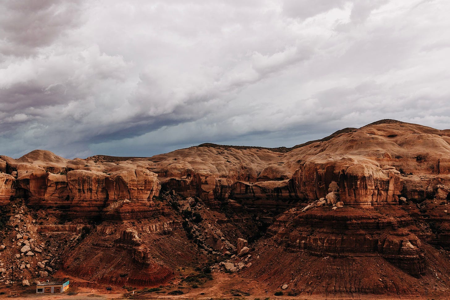
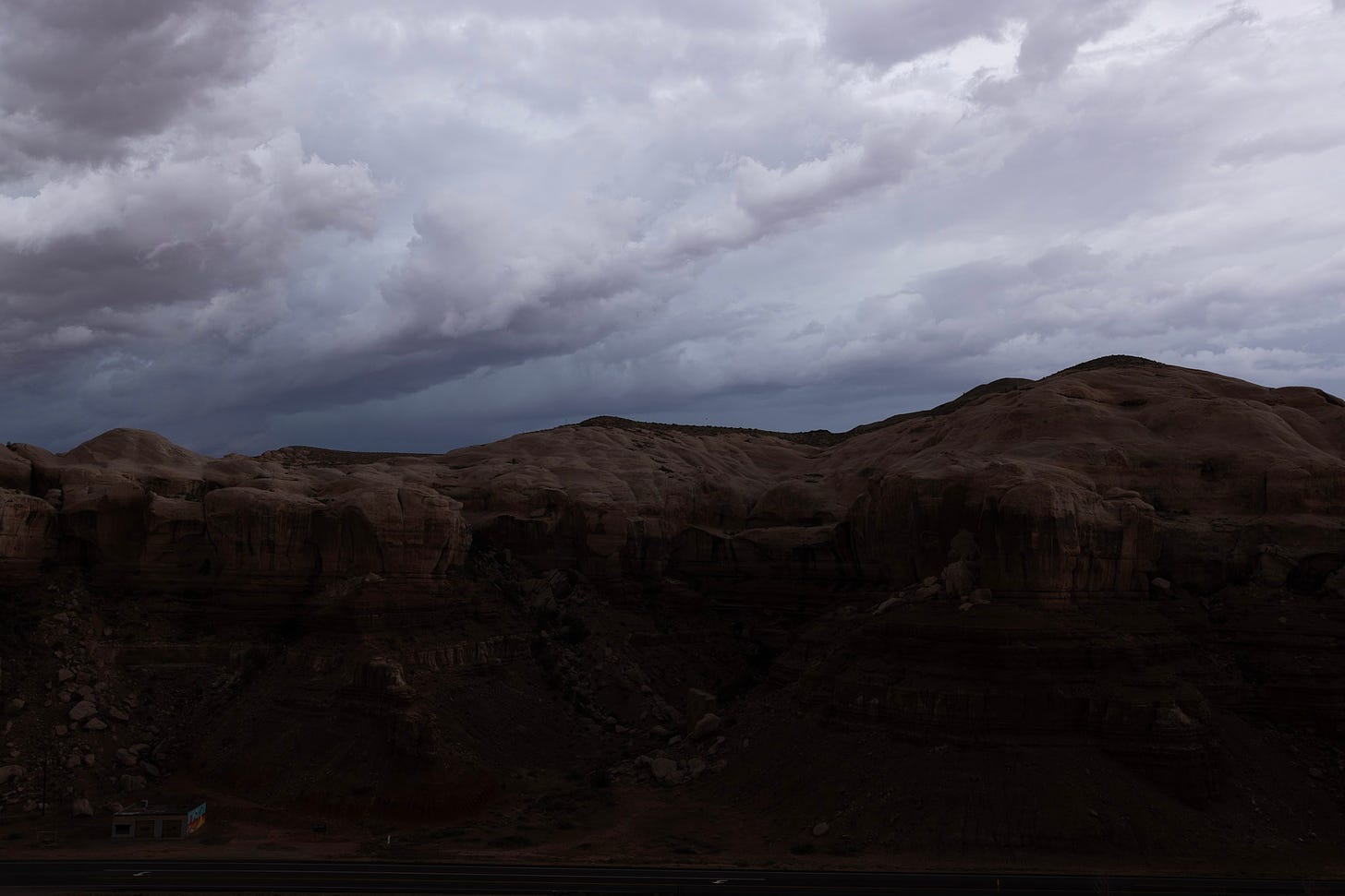
Some overcast days have clouds that I would just consider to be flat. It’s much easier to take an interesting photo of storm clouds. They have texture and depth. The clouds in this image have so much more visual interest than the ones in the first image.
I think there’s actually a bit too much texture and visual interest in this image; it gives the eye nowhere to rest. The cliffs are extremely detailed, the rockslides show motion in multiple places, and the pocks on top of the rocks draw my eye too. All of that has to compete with the clouds. In short, I think it’s just too busy.
I tried to crop out some of the clouds, but it doesn’t really help with the busyness of the image, and I do like the clouds, so in the end, I kept them in the frame. It’s not an A+ composition, again, but the clouds are cool and the rocks are cool and not all photos have to be art. Some of them can just be pictures of cool things.
Original:
Note: Cameras these days are incredible, and the image quality wasn’t at all degraded by bringing up the shadows in the bottom half of the image. Because cameras these days can capture a massive amount of dynamic range, I always shoot to expose the highlights correctly in an image and just trust that I’ll be able to recover the shadows.
3.
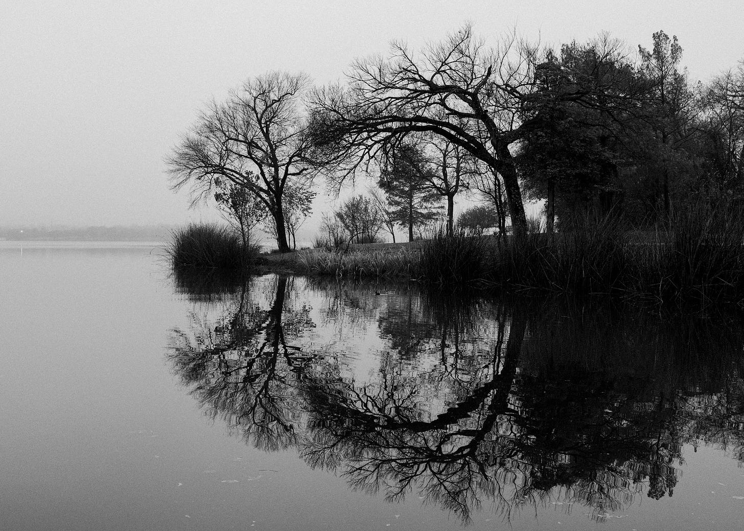
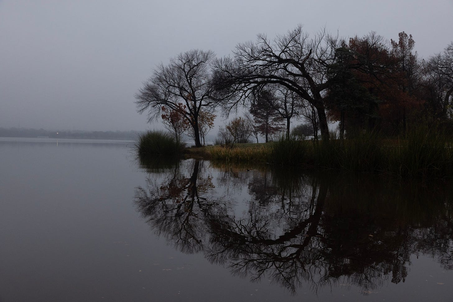
I remember seeing this composition as I was driving by the lake on my way back home. I’ve driven by it hundreds of times and run past it even more than that, but it wasn’t until this day that I saw the magic of the reflection.
This image has flat clouds like the first one, but since the clouds aren’t the focus of the image, that’s perfect. The visual interest is the shape of the trees in the middle, and the clouds are an excellent backdrop that don’t compete with the trees for your eye.
The scene is unbalanced. The right side is much darker and heavier than the left. There wasn’t really any way to take this photo without that imbalance. It also doesn’t suit a tighter crop. I still think it’s an interesting photo and the imbalance doesn’t really bother me because the tree shapes are so neat. I think I’d still print this one out.
Original:
Which of these images did you like the most? I think it’s harder for me to choose between imperfect photos than it is between good ones.
Links
1. We Hunted Hidden Police Signals at the DNC by Dhruv Mehrotra
Nevertheless, when taken together, the hundreds of thousands of data points we accumulated in Chicago reveal how the invisible signals from our devices can create vulnerabilities for activists, police, and everyone in between. Our investigation revealed signals from as many as 297,337 devices, including as many as 2,568 associated with a major police body camera manufacturer, five associated with a law enforcement drone maker, and a massive array of consumer electronics like cameras, hearing aids, internet-of-things devices, and headphones.
I’ve brought this up before here, I think, but the number of individually-identifying signals that your everyday devices give off are immense. They may not have your name or image attached to them, but your movements can be tracked using your Bluetooth beacons and Wi-Fi enabled devices.
There’s also some interesting information in there about the Stingray fake cell towers that law enforcement sometimes uses to extract information from cellular communications without hacking or having physical access to a device.
2. iPadOS 18’s Smart Script: A Promising Start But Don’t Toss Out Your Keyboard Yet by John Voorhees
I suspect most people are probably not thrilled with their own handwriting. I know I’m certainly not; it pains me to show mine off in this story. But that’s why Smart Script’s ability to refine your handwriting is so useful. The feature isn’t replacing your handwriting with a facsimile. Instead, it’s analyzing your writing style and preserving it while also smoothing it to make it straighter and more legible, which helps take the edge off of my scratchings.
I’ve been testing out this Smart Script feature in the new iPadOS this summer. I personally have not been wowed by it. It might have something to do with the fact that I write in all caps and perhaps the ML working on the handwriting refinement behind the scenes wasn’t trained on that enough.
My handwriting is something that I am—as strange as it is to type this—proud of. I wrote in script pretty well, but my printing was terrible and it didn’t look like the writing of every other girl in the 8th grade in the early 2000s. So I just switched to all caps in high school, which was distinctive and, well, it was easier for everyone to read too.
When I write notes on my iPad, they can get messy if I’m in a hurry, just like they can when I write on paper. But when I try and clean my notes up with Smart Script, they turn into an all caps handwriting completely unlike me own and I revert them back immediately. It’s jarring, frankly. The feature might get better, and I do think it’s improved marginally since June, but it’s not good enough for me to use. I’d prefer to turn it off completely and save the processing power1.
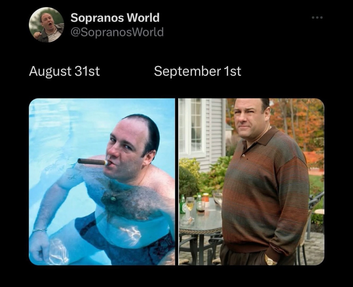
3. A Fall Meme
And hopefully also reduce the heat. My iPad gets extremely hot when I handwrite notes for too long right now. I hope it’s a beta thing that goes away after the full release.


Dallas 2023 is stunning!
My favourite photo is the reflected shoreline. Beautiful silhouette. For my taste, I made it a portrait on my iPad by cropping left and right sides to just eliminate any open white space on the left. It brings the duck into play and makes me wonder if it is a point, or a pond. It is astounding how you turned the Utah photo into a treasure by brightening the canyon!