Some vacations are slow and relaxing. You go to the beach and read for a week. You go to the lake and read for a week1. You go to a new town and just bebop around without an itinerary. This vacation was very much not one of those vacations.
We had just about every moment scheduled out to make the most of the week, and we definitely did and saw a ton of things. It was amazing. I’ll write about some of it in the coming weeks, but I’ve had an incredible time and I think I’ve got some great photos coming out from this trip too.
I am absolutely zonked, though. I’m ready to get home and do a little bit of nothing before going back to work next week. Before I get to take my airplane nap, I want to walk you through some photos of trees.
One final note: I don’t have any links for you this week because I’ve spent most of it without an internet connection and haven’t been reading much. In an Uno reverse moment, I’d like to ask you to share a link with me that you think I should read!
Photos
1.
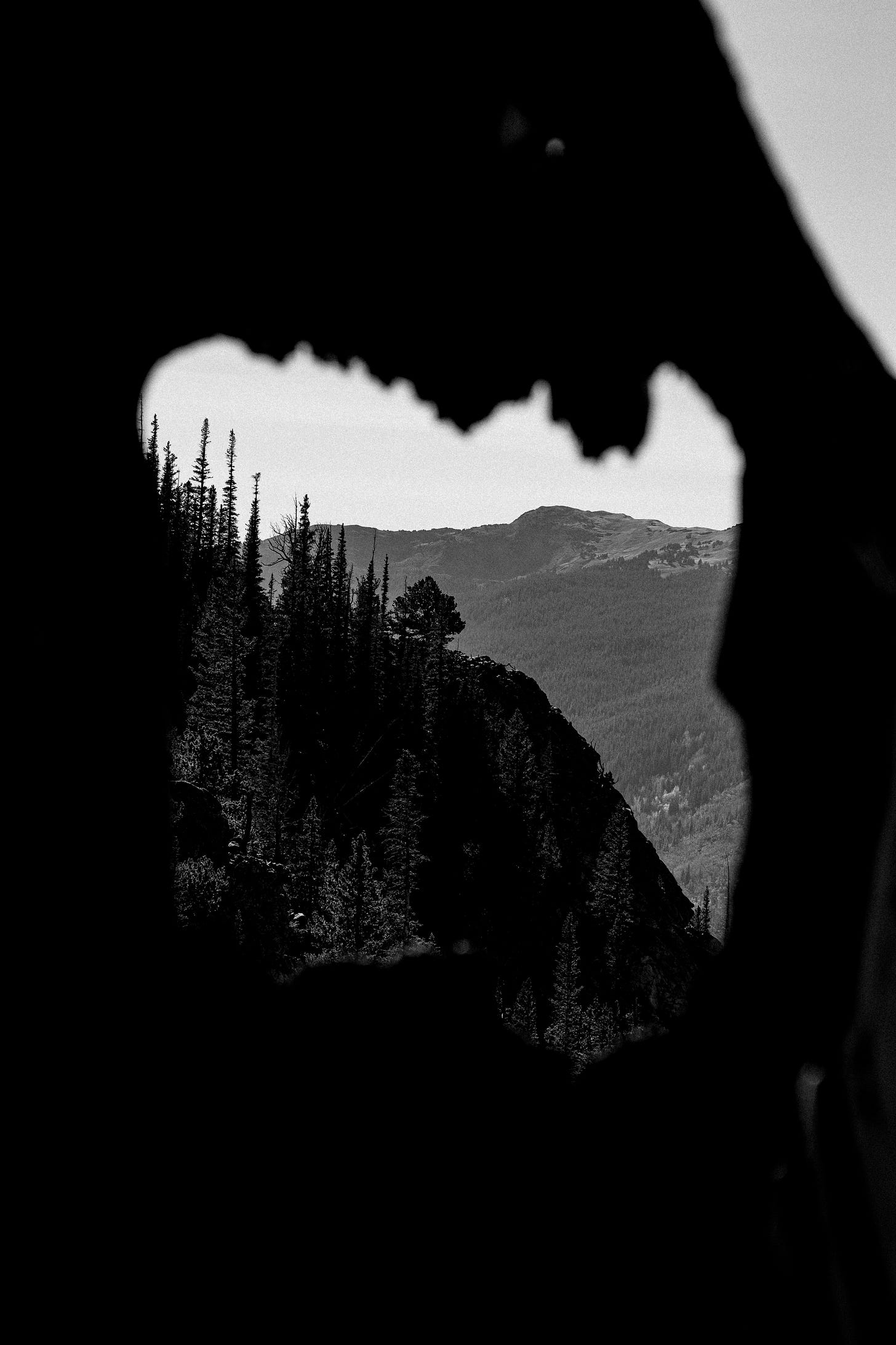
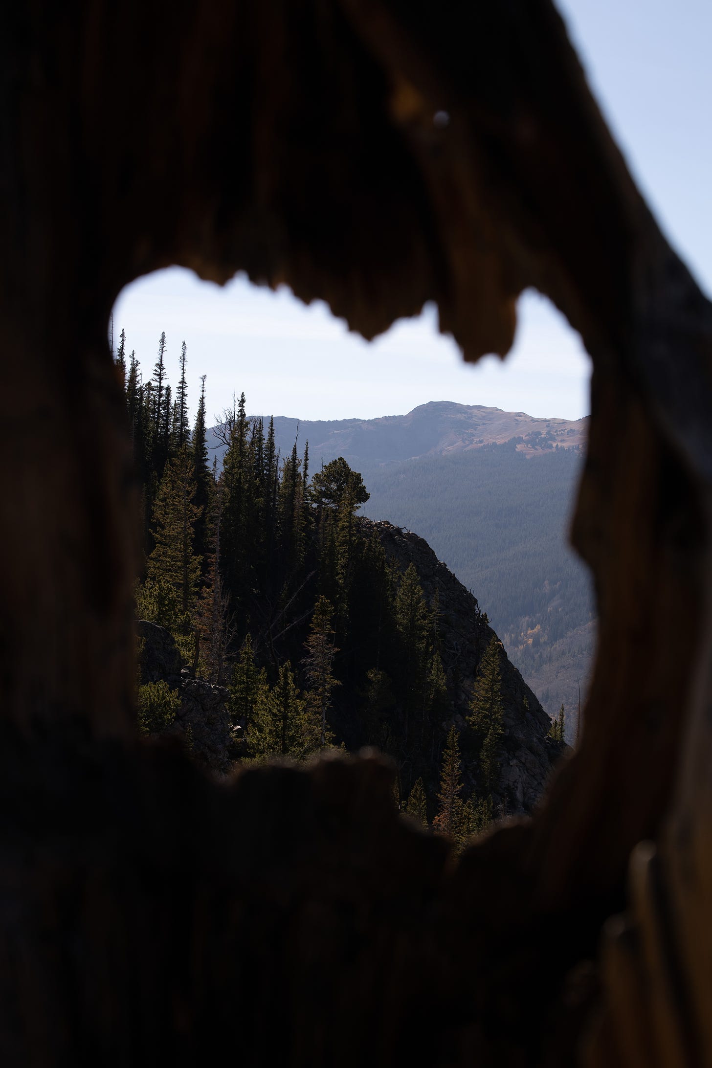
Using a cutout in dead tree to frame an image of more trees is probably a little too on-the-nose middle school photography class, but it felt serendipitous that the mountain lined up so well within the frame. This photo is one that’s close to my heart.
I put it in black and white because the light and colors took away from the composition2, which is the real subject of the photo. I tried a crop that took out the sky in the upper right hand corner of the image, but it never looked right, so I am retroactively deciding that it’s a metaphor for how easy it is to get trapped into a certain way of thinking and forget that there might be another way.
Original:
2.
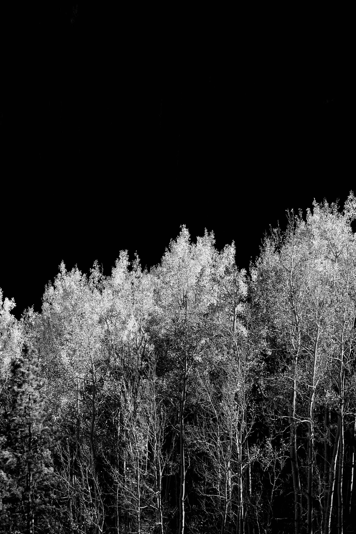
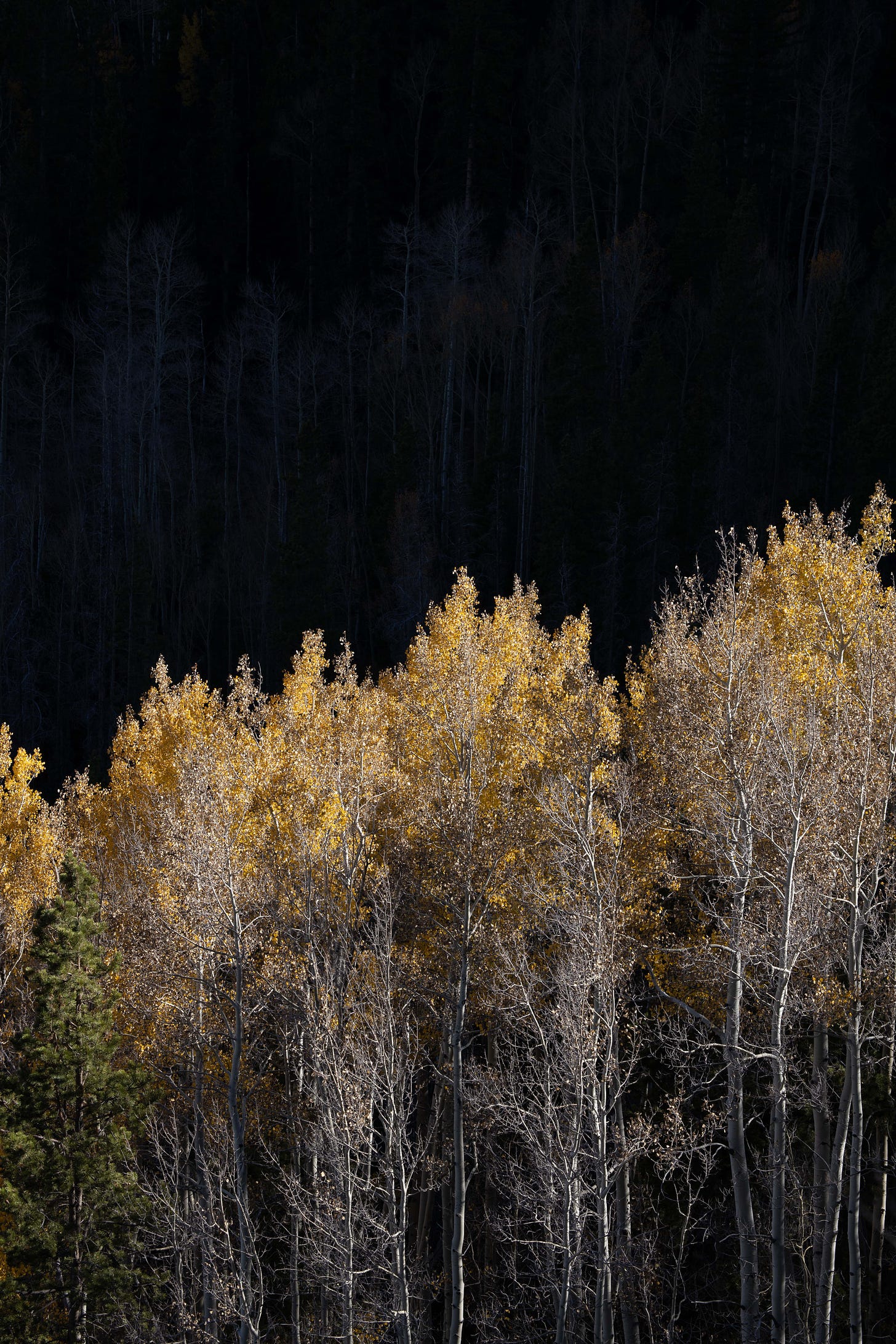
I took this photo on the same trip and the same day as the first one. It was an incredibly productive hike! I actually have a few different versions of this photo. This isn’t the one I printed, but it was the one I took that got me on the path to the printed one.
One of my photographic tropes that I come back to is the idea of trees as a canvas to showcase the light in the mountains. Late afternoon light in that kind of environment is majestic. The sharp contrast between the shadows cast by the mountain ridges and the brilliant golden hour light right next to that darkness is really fun to explore.
I don’t remember if I intended to edit this as a black and white photo, but I think I figured out that was what I needed to do with it very quickly. I like that the blackness of the shadow almost makes this look like a photo illustration.
Original:
3.
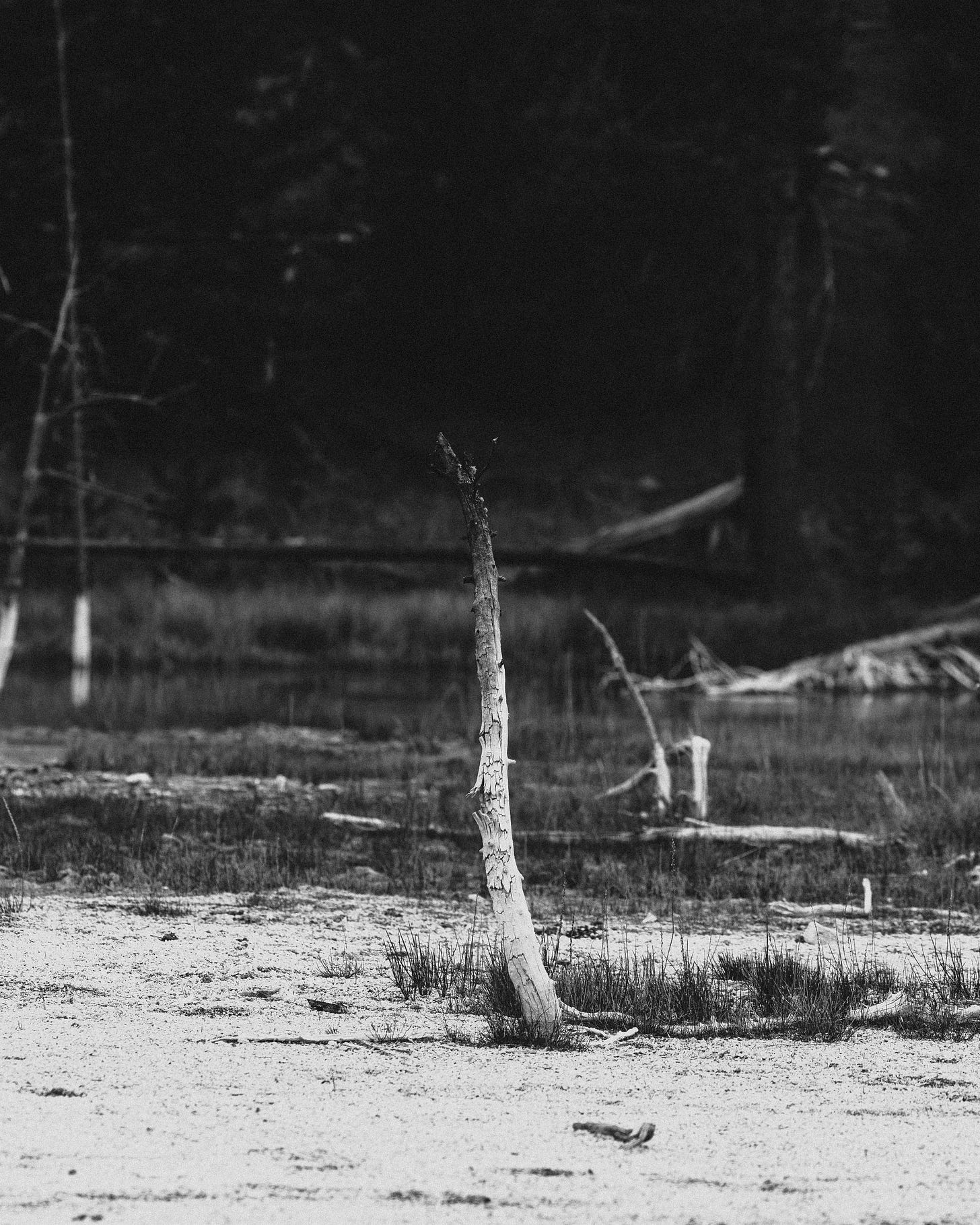
I knew exactly what I wanted to do with this photo when I took it. One of the differences between the photographer I was four years ago and the one who took this photo is that today I don’t waste nearly as much time on shots that I don’t already have a vision for when I pick the camera up.
The gradient on this dead tree was extremely cool in person. We saw a lot of them on this trip, and when I saw the first one, I knew I wanted to try and get one isolated and stick it right in the center of the frame.
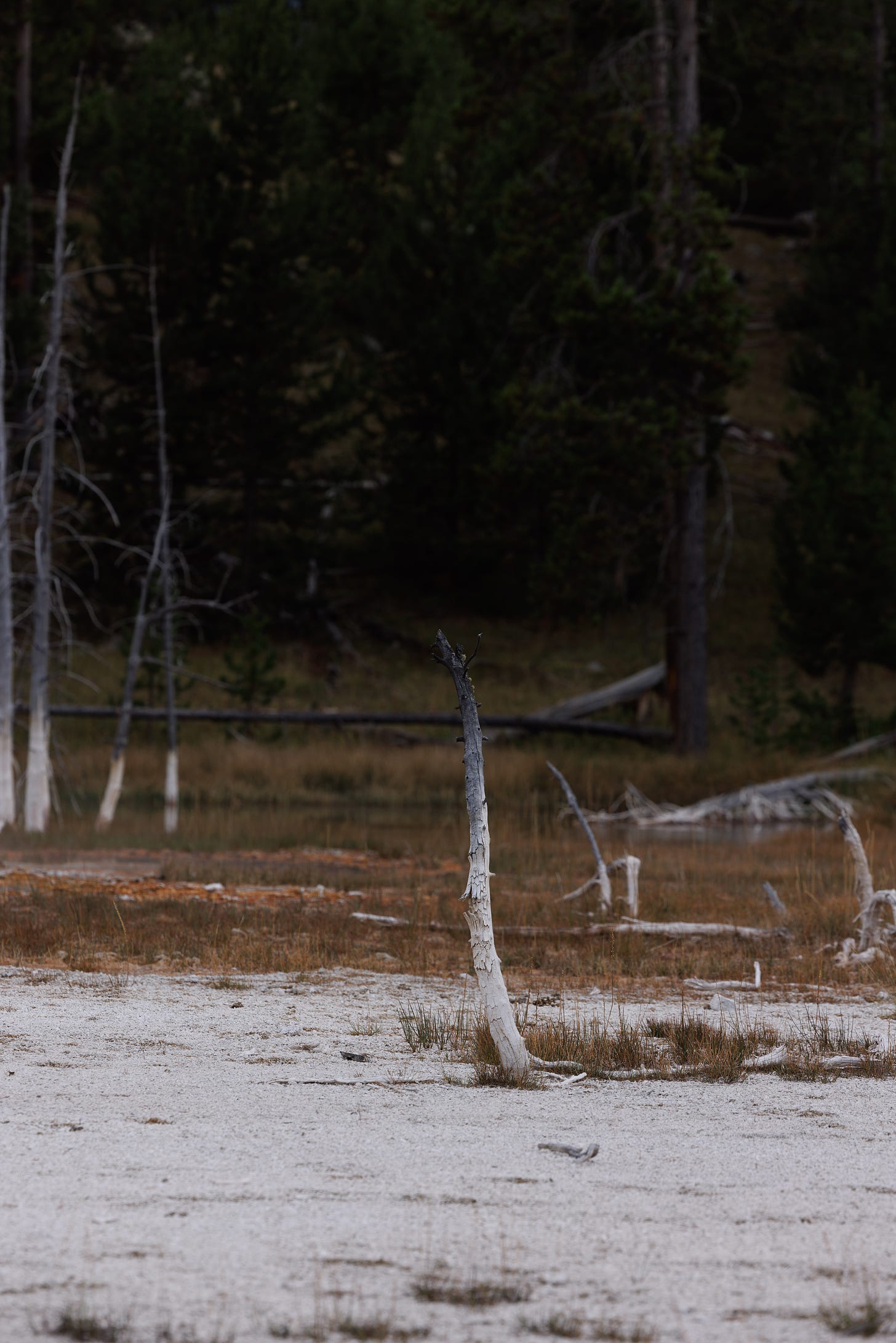
It’s a little busy, but overall, I really love it. I could have tried it with a shallower depth of field to isolate it more and maybe clean the background up some. I still think it works well as-is. This one might also work well with a square crop, but I like the texture in the foreground too much to lose any more of it.
Original:
The destination depends on whether you’re an offensive coach or you’re a defensive coach. If you’re on the offensive side of the ball, you go to the beach. Defense is lake. I don’t make the rules. I just heard it on
.“Hey,” you say. “Sam Pittman has a lake house, but before he was the Arkansas head coach, he was an o-line coach!” That seems like it breaks the mold. But I think that if you’re an o-line coach, you’re a lake person because you’re coaching the defense of the offense.
Or at least they didn’t add anything to it.


Your black and white images are some of my favorite