My Favorite iOS and iPadOS 18 Features
Taking a look at some of the features that I think have flown under reviewers' radars
It is the end of September, and the most magical season of the year is upon us. There has been a fresh new release of operating systems for Apple devices. We have all sorts of new features and tweaks available to us now! You can move app icons and widgets around on your home screen however you’d like!
Okay, that’s not a really killer feature. This release is a bit short on those. But there are some really great things hidden in here all the same. I want to go over the things that I’ve found most useful in the three months that I’ve been testing this new software during the beta period. There are lots of resources for more comprehensive reviews, including ones at MacStories and Ars Technica.
If you’ve used the software and found other low key features you really like, share them in the comments!
Vehicle Motion Cues
The name of this feature isn’t particularly descriptive, but you might be more interested in it if I tell you what I wrote it down as in my notes: anti-carsickness dots. Take a look at the short video below from Apple to see how it works.
This feature wasn’t really spoken about at all at the WWDC keynote. In fact, it was actually announced as an iOS and iPadOS 18 feature back in May as part of the Accessibility features that were going to be included in that update. But it was this feature that made me decide to use the betas.
I find myself working in the car more often than most people do due to the fact that I work remotely full-time. I’m also the kind of person who uses an iPad as a computer, so this feature getting added to both the iPad and iPhone meant that I could doodle around on my phone when I’m a passenger and not get carsick, but I could also work in the car for more than about 30 minutes too!
After testing it all summer, I can say that it does work for me. This has been the single most impactful feature that Apple has released in a software update in years for me, and I don’t think they’ve done enough to publicize it.
If you’re someone who gets sick looking at devices in moving vehicles, this feature can be enabled within the Settings app. When you get into the Settings app, use the search bar and type in “vehicle”. The only result is the one you’re looking for. Enable it, and then when the device detects that you’re in a car, it will automatically turn on. You can also choose to enable it in the Control Center manually. Which leads me to…1
Control Center Customization
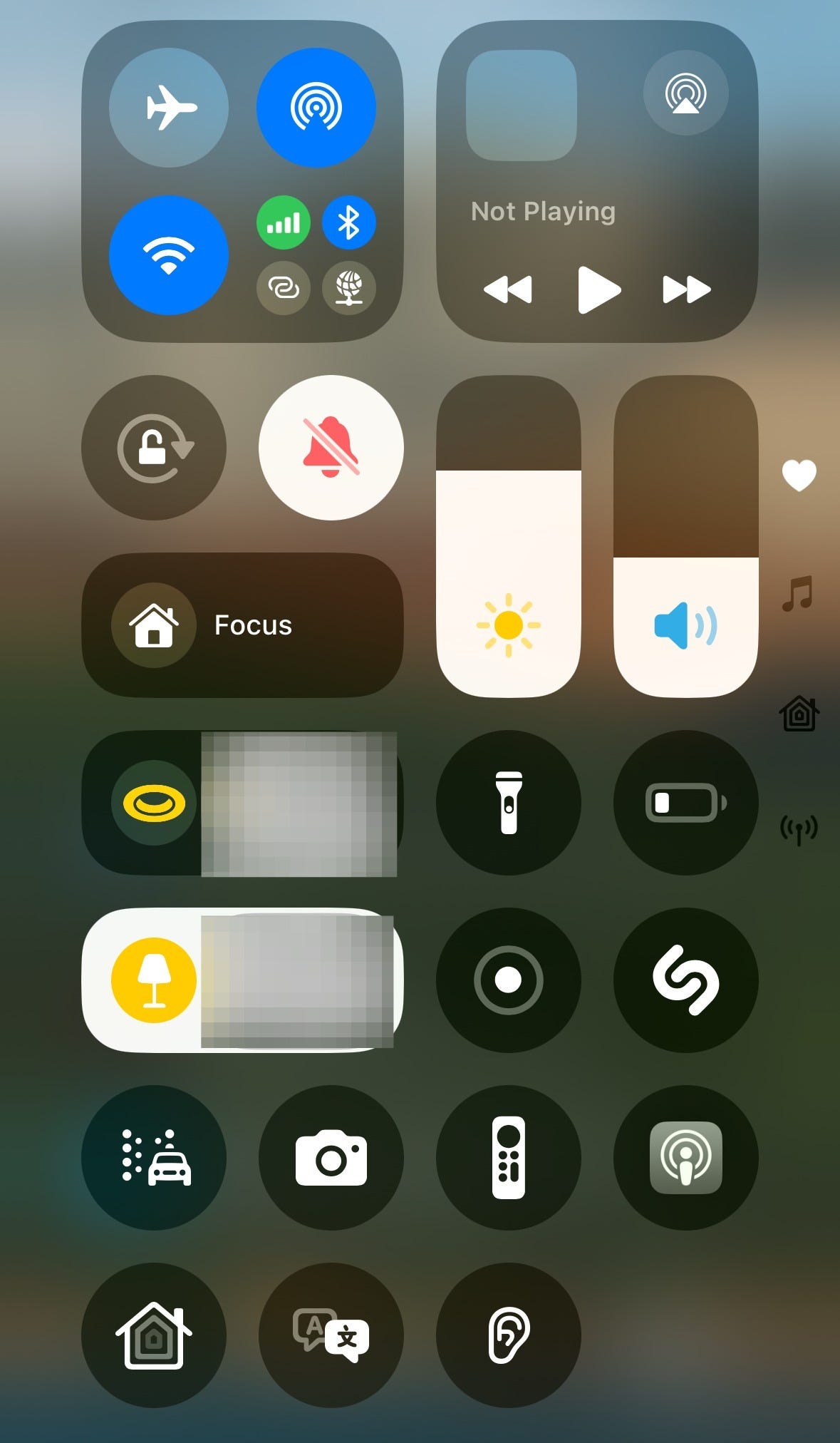
This release allows you to actually make your Control Center a useful place to quickly adjust settings, control your audio and home devices, and keep your most frequently used shortcuts always just one gesture away.
Right now, I’ve seen the most value out of having a lot of the settings that are otherwise buried in the Settings app surfaced in a central location.
Some of this already lived in the control center, but there are new additions to this screen that couldn’t have lived here before this update. The Vehicle Motion Cues toggle is the one on the left on the second-to-last row. I can also launch the Podcast, Home, and Translate apps from here. Those are apps that I use regularly, but when I use them, I’m not always just opening my phone to do it; oftentimes I’m already on my phone and don’t want to close the app I’m in, go to my home screen, open the folders that these apps live in, and then open them. With this update, I can just swipe down from the top of the screen and launch them immediately.
The other really nice addition to the options for this screen is the one that’s the ear icon. That’s the Hearing Assistance setting, but buried within that is the Background Sounds option, where the iPhone can generate a range of different white noise-type sounds. I use this most frequently when it’s raining outside at night and the dog is freaking out and I want something playing on my phone to drown out that sounds so he will settle down.
Third party apps are slowly adding their own options for the Control Center. These shouldn’t just be little controls that you can add that will open the apps themselves; this is something that you can already do as long as you have the Shortcuts app installed.2 Ideally, developers will be surfacing frequently-used functions in their apps that you can start using straight from the Control Center instead of having to open up the app and do it from in there. That’s essentially what Apple has done with these system utilities that you can toggle in here—they’re just elements of the Settings app that you can now access more directly.
Reminders in the Calendar app
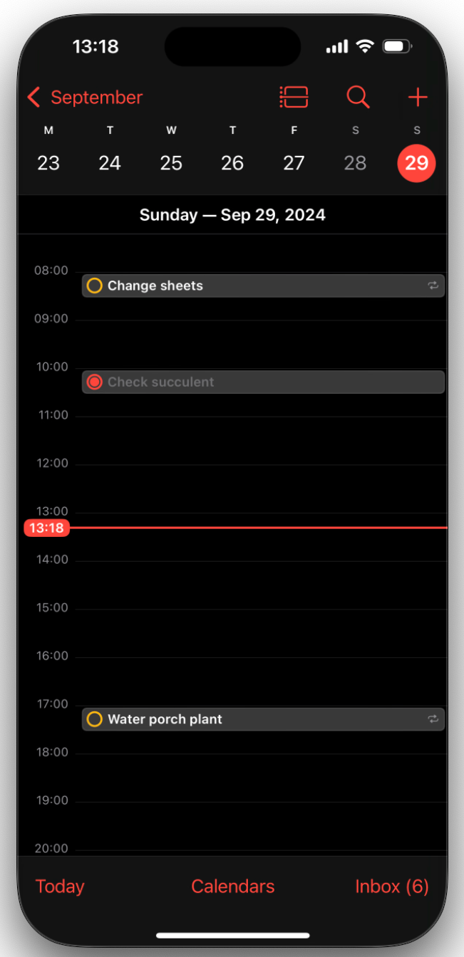
I didn’t really use Reminders all that much until the beta this summer, but the ability to see the reminders in my calendar has changed all that for me. I’ve always used the Apple calendar to schedule my home life, and now that I can see both my calendar appointments and my reminders, or—what they ought to be called—tasks in one place, I’m actually using the reminders to keep my life more on track.
Being able to reschedule reminders in the calendar app means that I can actually visualize what a reasonable due time for a task is. This is especially useful for recurring tasks like paying my running coach or watering the plants. If I set a due time for 4 PM for those but I have something scheduled during that window this week, I can adjust it on the fly instead of having the notification pop up during a meeting, dismissing it, and then forgetting about it forever.
Messages
RCS Messaging
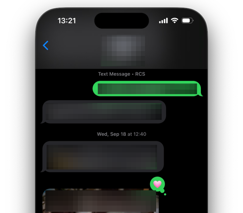
Green bubble people are on more even footing now. Reactions and replies to messages work correctly now and videos don’t show up as 1 cm pixelated squares. This is a quality of life thing for most people, but RCS also makes messaging non-iMessage users more secure as well.

In the redacted image above, the person sent me an image in the last visible and it’s showing up as a real image. It’s showing up the same way that it would if someone with an iPhone had sent it to me.
My reaction to their posts sent correctly to both them and to me, and when that person reacts to my messages, it shows up for me the same way it would if an iPhone user had done it.
This is the real change for iPhone users in this update, because Android had already done the work to make iPhone-to-Android reactions render correctly. Apple was the one stubbornly refusing to handle Android-to-iPhone reactions correctly. Instead, the reactions would send as new messages that simply said “[Android Contact] reacted with heart".
More reaction options!
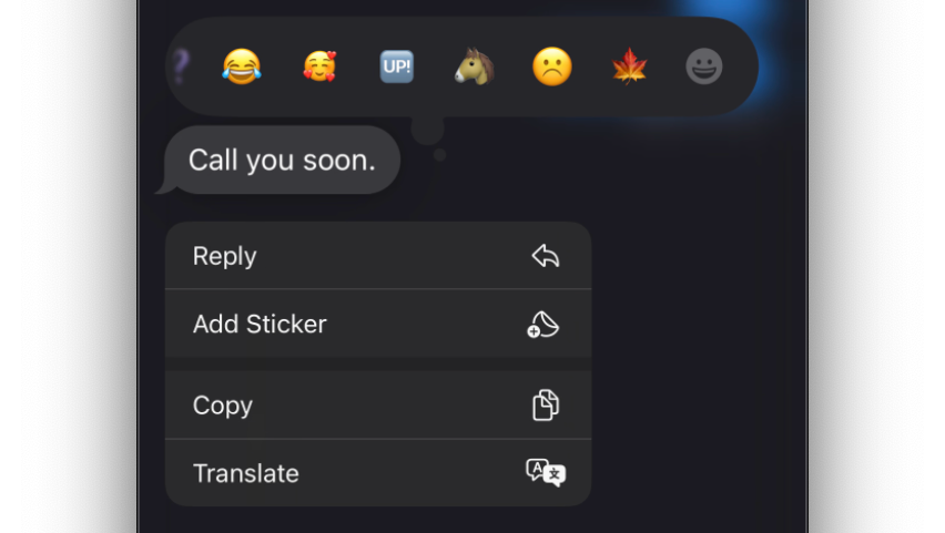
The six built-in message reactions just did not cut it in 2024. Now you have every emoji and sticker available as a reaction. Wait, stickers?

Yes, stickers. If you’re a Slack or Discord user, you know how invaluable custom react emoji are. Stickers are essentially the custom emoji of the iPhone world. You can create them from photos by long pressing on the subject of that image, but you can also download Slack or Discord custom emoji with transparent or white backgrounds and save them as stickers as well.
I’m really excited about the stickers. As a blob enthusiast, I have always wanted to be able to bring over my :blob_lul: into non-Slack messages. By saving them as stickers, I can! I can add them as inline emojis just like I can with the regular unicode emojis.
Pro-tip: If you’re bringing them over from Slack, you might need to find higher res-versions of your blobs than what are uploaded and saved to Slack. I couldn’t find a higher res example of the specific :blob_lul: emoji that I use all the time, and that meant that Apple just rendered the low-res version as a very small emoji, which was not ideal.
To fix that, I went to an AI-upscaling web app and uploaded the version I had. Since it was extremely simple, I was able to get a version from that web app that was 4x larger than what I uploaded. Because it had enough pixels, my phone was able to render it at the same size as a normal unicode emoji and now I’m happy.
Privacy
FaceID protections for any app
You can protect any app with FaceID now. Until now, you’ve been limited to using FaceID to sign into an app, and it’s usually been implemented by apps that are highly sensitive, like your banking apps or money transfer apps. Now you can protect any app behind FaceID, regardless of whether it requires a sign-in. You can also hide any app on your phone, and either of these options will now keep information in that app from being indexed and returned in device search results and from being able to send and show notifications on your phone.
The obvious way that this will be used are to protect and hide apps that you don’t want a significant other to find out that you have. I just want to get that out of the way first, because I think people are writing this feature off as only useful for cheaters to cheat. But hang with me, because there are benign uses for this feature too.
Your kid loves playing with your phone but you want to make sure they don’t accidentally click around and order something on Amazon or another e-commerce app? Require FaceID to open it.
If your job deals with work that is particularly sensitive, protecting your email app and Slack or Teams apps behind FaceID is probably a really great extra layer of security. Keeping those messages and contacts from being surfaced in search results is excellent as well.
VPN apps are also great examples of apps that could benefit from FaceID protection. If you use one to remote into your home or work networks, requiring FaceID is another block on someone with ill-intent poking around your phone and getting into networks that they’re not supposed to be in.
If someone already has your phone and your passcode, none of this does any good. But social engineering attacks—where someone gets you to hand over your device while it’s already unlocked (to look at a video or add their contact information or any other innocuous reason you might relinquish control of your device)—this would keep them out of the places you really don’t want them to be.
Extremely precise contact sharing permissions
You can now choose exactly which contacts to share with an app that asks for permission to access your contacts. My brother used WhatsApp for his wedding group chat and it wouldn’t let me join the group without sharing access to my contacts list. It was infuriating. This new feature would have allowed me to share access to a single contact and hopefully bypass that data-mining roadblock.
Limiting apps’ access to your contacts helps keep your network private. This contact data can be used to build profiles on you and map out who you know. With this, you can start creating maps of data of communities and networks, and at that point, if any one person within that map gives permission to the wrong app or website, everyone’s privacy can be compromised3.
Where was Apple Intelligence in this review?
I’ve seen a lot of anger about Apple Intelligence from people who haven’t used it yet, and I do think it’s somewhat misplaced. I’ve been using these features as they roll out for the last month or so. Since this is all contained in the 18.1 beta, I don’t want to put out a formal review of the features right now, but I do want to put some thoughts out there.
Generative AI
I don’t care for the generative stuff, bit I haven’t used it because it’s not out yet. There’s a huge chunk of the AI features that are non-generative and are meant to make your phone more useful with less input from you that I think people are going to appreciate if they can get past the bias against “AI”.
Email, Text and Notification Summarization
The email and text message summarization features are excellent for someone like me who is easily distractible but also hates the anxiety of the unknown requests and obligations hiding behind unread notification bubbles. I can get the gist of a message and determine whether or not it’s something I need to break away from my current task to address. The phone is also able to prioritize emails and text messages based on the content in them and bump the ones that look like they might need quick responses or other actions to the top.
It’s not perfect, especially for general notifications. I see a lot of Bluesky notification summaries that are completely wrong because it struggles to understand the difference between the account that replied to or liked a post of mine and a person that might have been mentioned in the post that was being reacted or replied to.

Webpage Summarization
I don’t use this feature much, but I did find one use, and it’s a bit of a product of our current generative AI hellscape reality.
There’s so much AI SEO-bait dreck out there that ranks highly in searches that wastes my time when I’m searching for an answer to a question. I’ve begun to occasionally use the summarization feature when I use those sites to determine whether or not it’s going to be a remotely relevant research tool for me, or if it’s just another garbage website that exists to generate ad money.
I hate that this is a tool that’s useful for a world that I live in, but until search engines improve, I expect to need tools like this to keep me from wasting my time on websites that exist only to waste my time.
Final Thoughts
This was not a blockbuster release. It was clear that the efforts of the engineers went into the Apple Intelligence features more than individual new OS features.
There are some really good things in this that I would consider to be tweaks rather than full on feature releases.
I wanted more for the iPad, as I always do.
Let’s do the iPad Pro discussion again
The first post I wrote on this site was about the iPad Pro all the way back in 2021. Although I’m not sure I mentioned it, this was the first iPad with an M-class chip in it, and just about everyone thought that was a sign…
There were a couple of neat things that were released for the iPad, but they didn’t really move the needle for me, and for yet another year, we’re stuck with the hardware equivalent of a football team full of five-stars being coached by the software equivalent of Jimbo Fisher.
Talk about a transition!
If you do, when you select the Add a Control button in the Control Center, you can scroll down to the Shortcuts app options and you’ll see that there’s one listed to open an app.
Think about how useful it is for local and federal law enforcement to both have the power to arrest and charge people with crimes and to be able to know who someone knows. Are you sure there’s no one in your contacts who hasn’t committed a crime?
”But I wouldn’t give that information to law enforcement!” No, but they can buy that data from the app that you did give that information to.


Ha, the timing of your commentary could not be more propitious and helpful than right now. I ordered my first new iPhone (16) to replace my aged and infirm 6+. My last installed iOS is so ancient that when confirming my model, Apple informed me I own the "iPhone Obsolete." lulz.
Anyway, that truth places me in the difficult spot of getting up to speed on all the OS and app updates, enhancements, and improvements over the past many years. That said, I admit I am absolutely mystified what to make of the anti-carsickness dots. So the dots move, what of it? Do those moving dots prevent carsickness for the iPhone - or for me? Probably the iPhone because they do nothing for me. Out-of-date (or obsolete) refers more to me, I fear, than my iPhone.
Thank you for another excellent post.