Photo Friday: Bright and Flat
After the break: The longest OS review ever, every computer review is about video editing, and a football team gets roasted in a federal court opinion
After a week back in reality, I’m starting to dive into my photos from the trip and get to editing. I ended up with about 2,000 of them, so I imagine it’ll be a little while before I run out of new ones to share!
One of the highlights of the weekend that I’m looking forward to—other than the lows in the 60s—is Southern Methodist University’s first ACC conference football game on Saturday! I think the energy is going to be great after they beat their cross-town rival, TCU, last weekend.
This week, I wanted to look at a couple of similar photos that I edited very differently.
Photos
1. Bright
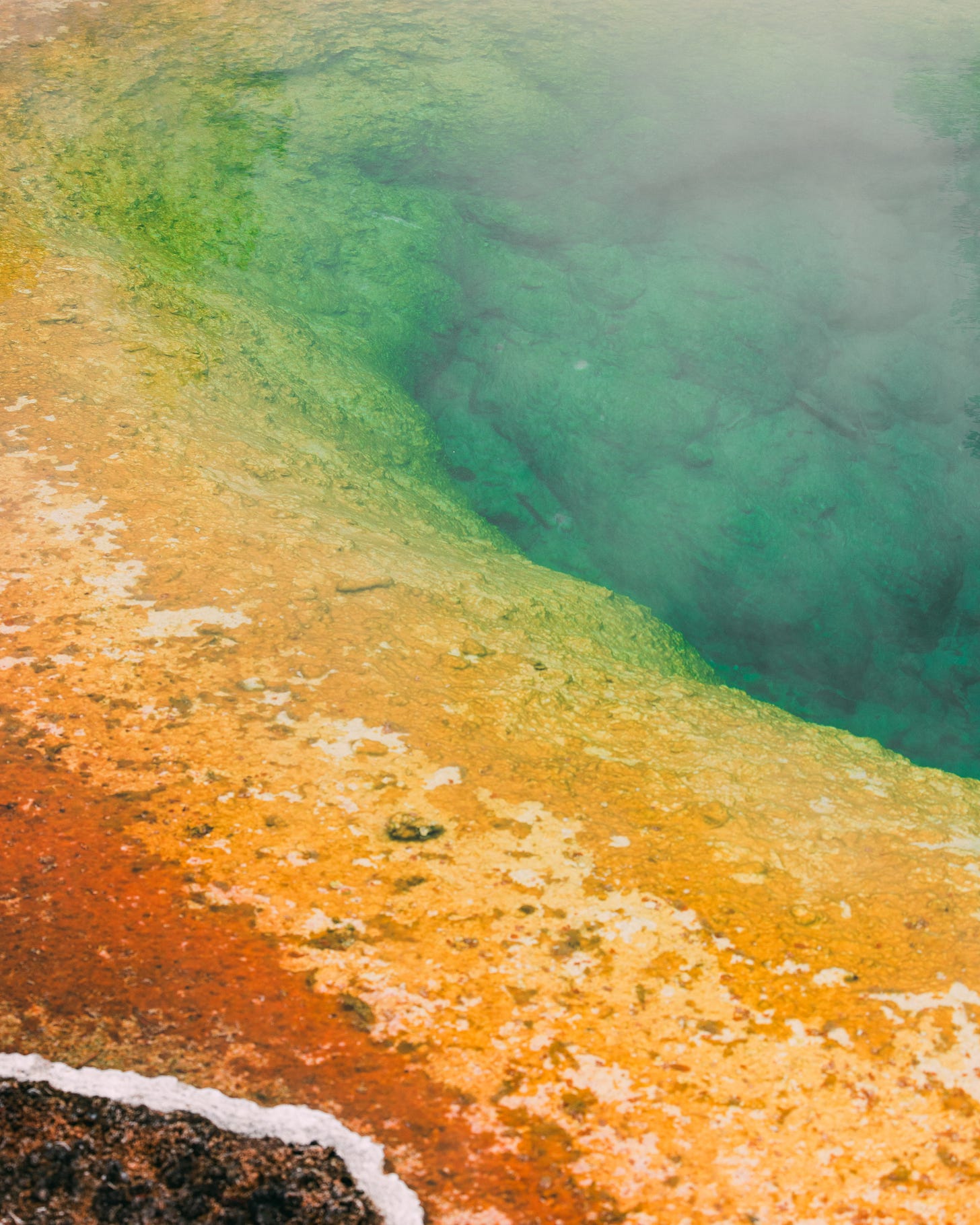
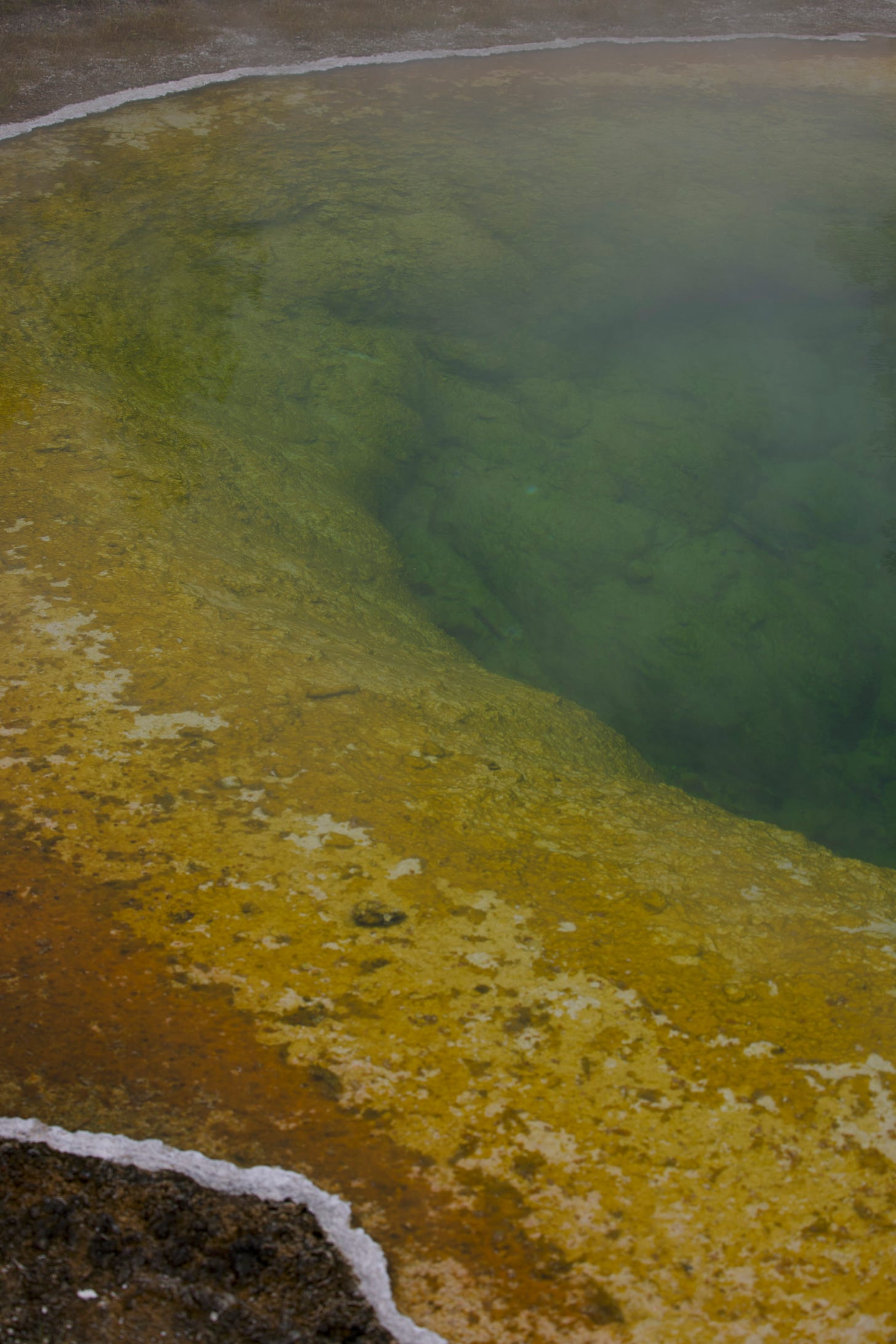
I did not know that geysers could look anything like this! That’s what this is, though. A geyser that looks like a rainbow. This one is the Prismatic geyser. Or part of it, I suppose.
Very early on, I decided I wasn’t going to try and capture many whole geysers. The real magic is in the details, and if you get too greedy and try and bring together too much magic in one frame, it ends up disappearing completely. This geyser was essentially just a giant, warm, colorful hole in the ground. The colors come from different minerals and bacteria that live in the water and then the depth of the geyser introduces the rich greens and blues closer to the middle.
I went bright and vibrant on the colors in this edit because the light that day was pretty good. It wasn’t sunny, but it wasn’t as dark and gloomy as most of the rest of the trip was. (More on this in a bit.)
I liked this frame because it gave you a little bit of everything but everything of nothing. You can’t really tell what it is or how large it is. There’s no sense of scale beyond what you can discern based on the depth of field. Since I shot this with a telephoto lens, the depth itself is a bit distorted. You’re able to abdicate the responsibility of figuring out what’s in the photo because there’s no context with which to do it. You can just enjoy the colors and the textures.
Original:
2. Flat
“Did you even edit this one?”
Yes, I did, but it’s a bit different from my usual style, I’ll grant you that.
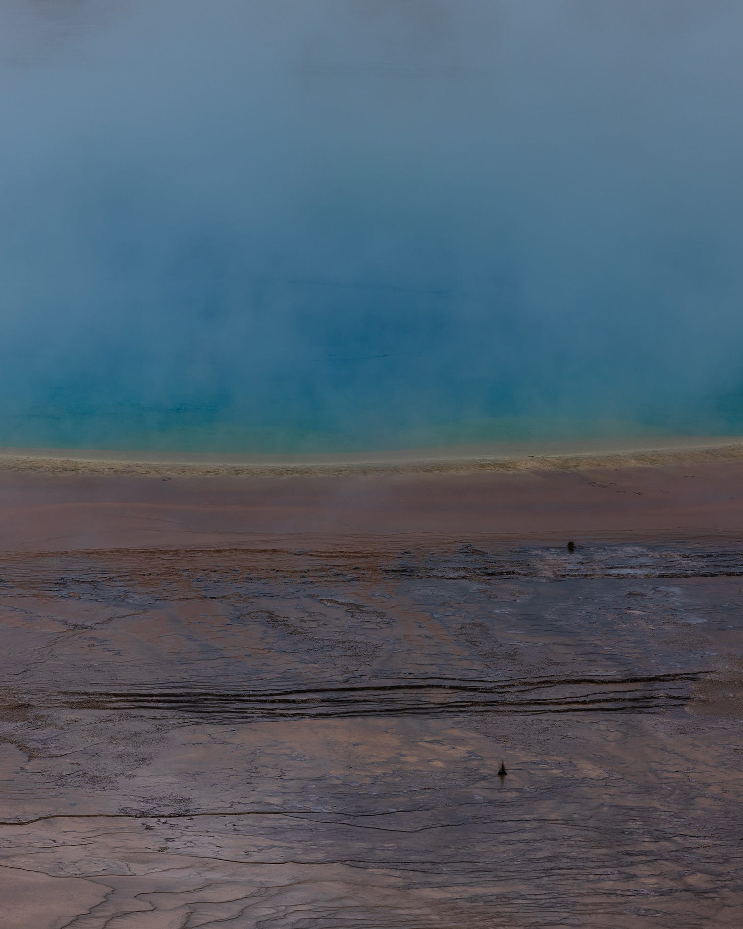
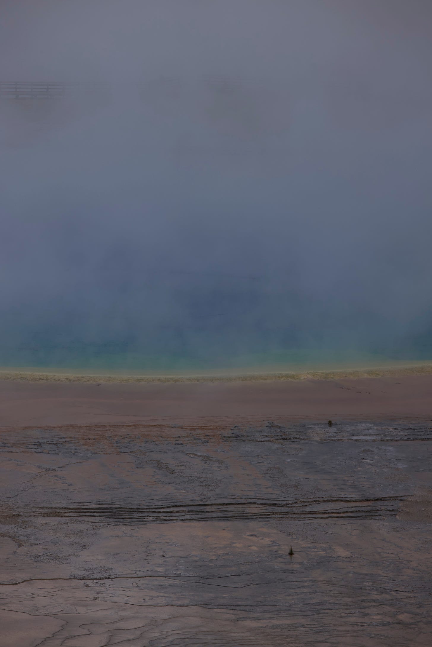
This is a photo of the Grand Prismatic geyser that I took the day after the previous photo. It is absolutely massive. I knew that from where we were going to be observing it, there was no way I’d be able to capture the colors the way I wanted to and get the whole thing in the frame, so I started looking for interesting slices of it that I could get texture and pattern details from while also preserving the color.
It was extremely cloudy and rainy on the day I took this shot. Dark clouds in the sky can still show up in the water in the form of a bit of a pall on the colors, and trying to fight that with pumped up saturation and vibrance sliders can produce an interesting result, but your brain can almost always tell that something about the photo is off.
Instead of trying to fight the gloom, I just leaned into it with this edit. The colors in the geyser were arguably more vibrant than the ones in the previous photo, so instead of trying to make the photo brighter on the whole and brighten the reds and oranges of the surrounding area, I focused on getting the purple through yellow part of the spectrum right and let the rest do what they would.
I loved the texture of the surrounding rock, and the two little plants that interrupt what is otherwise a very flat photo. If you look at this one long enough, you can see that some of the reddish mineral is washing down toward the bottom of the photo. The geyser isn’t a still body; it’s always circulating water and there’s life and movement at all times.
Deliberately taking an understated approach to color is not generally my style, but I’m happy with the result of a bit of restraint this time. I think this photo would look very good as a large print. It has the interesting texture and detail of what would usually make a very good black and white print, but the colors are subtle enough that they’re not overpowering even in a large format.
Original:
Links
1. iOS and iPadOS 18:The MacStories Review by Federico Vitticci
This review is extensive. But if you want to know what’s new on your phone, this is the article for you. I’ve been reading Vitticci’s reviews for years now, and I always appreciate the amount of detail he goes into. Even when I run the betas myself, there are features he points out that I didn’t even know about.
I’ve written my own newsletter on iOS and iPadOS 18 that’ll be in your inbox on Monday, but mine is more of a focus on my favorite features that have been overlooked by reviewers or on unique use cases that I have for features that have made them indispensable for me this summer.
2. Why do these YouTubers keep talking about video editing? by Matt Birchler
It's ultimately a tricky thing — people want to watch reviews of computers, they want those videos to be well researched and relatively nicely produced, and they say they want them from non-reviewers or people who don't do video production.
I don’t know if you’re much of a tech YouTube watcher, but I do tend to dabble there, and I’ve seen this happen over and over again. I think Matt makes a good point here in the end, though. Most people who only have general purpose computing needs will never do anything that can actually tax their device, and that makes for an incredibly boring computer review. “Yes, this will work for your needs, but so will last year’s computer and probably any computer made in the last five years!”
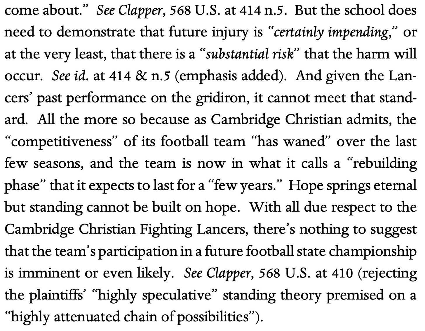
3. Shade by the 11th Circuit Court of Appeals
This high school wanted to sue about something that might or might not happen at a state championship game. The 11th Circuit told them that based on their record over the past few years, they were in no danger of making the championship game and therefore lacked standing to sue over this particular item.


